Koç Sistem Web Development
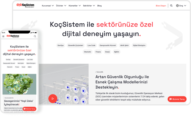
We have redesigned and developed kocsistem.com.tr for Turkey’s leading technology company, KoçSistem, with asimplified design language and solutions.
KoçSistem Web Development
BRAND
KoçSistem
CLIENT
KoçSistem
LOCATION
Istanbul, Turkey
INDUSTRY
Technology
RELEASED
2024
OVERVIEW

About the Project

KoçSistem, a robust technology company developing its products and services, providing next-generation technologies and integrated solutions, asked us to redesign and redevelop its corporate website design, which had become outdated in design language and technology while preserving the content.
01
Complex and Confusing Information Architecture
Over time, as new content was added to the website, the information architecture became more complicated than necessary. This complexity often led visitors to leave the site without finding what they sought.
02
Creating a Concept in Line with Brand Identity
Content designed that with different approaches has caused the visual language to drift away from the corporate identity. The new website needed to reflect the traces of the KoçSistem brand. We were expected to redesign the interface to align with the brand language.
03
Highlighting Important Content
Our client wanted us to ensure easier access to the products and services that needed to be highlighted in the website design, which were not easily discoverable on the existing site.
04
Slow Loading Speed
The slow loading speed of the website negatively impacted the user experience.
HOW WE DID?

Expertise

Research
UX Design
UI Design
Prototyping
Web Frontend Development

API Integration
Backend Development
Quality Assurance
Team

1 * UX Designer

2 * UI Designer

4 * Front-End Developer

2 * Backend-End Developer

2 * Project Manager

2 * QA Engineer

Tech

React

Next.js

Typescript

Storybook

GraphQL

Figma

Directus

Project Timeline

~5 Months

Project Timeline
DISCOVER

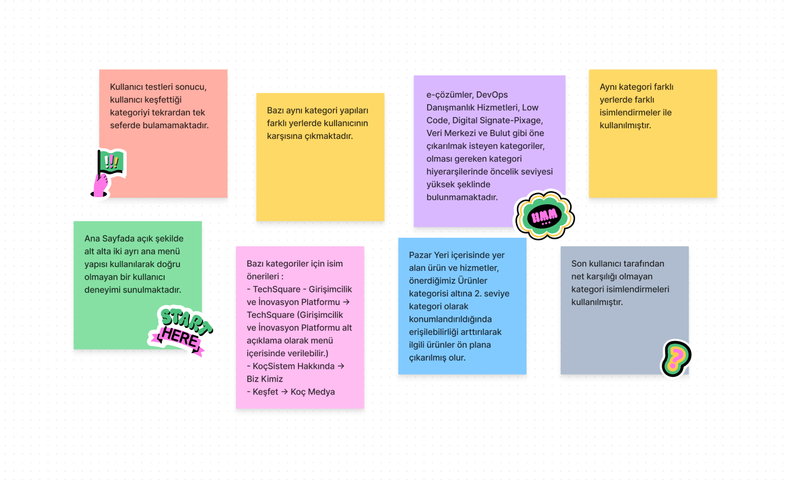
Heuristic Analysis

We began our discovery process by performing a heuristic analysis of the existing website to identify pain points. We categorized these pain points into three levels of importance: critical, major, and minor. This analysis helped us pinpoint the main areas to focus on for improvement.

Reviewed structures:

Homepage structure
Information architecture
Level 1/2/3 categories
Products to be highlighted
Search mechanism
KoçSistem Web Development Heuristic Analysis
BENCHMARK

Benchmark Analysis

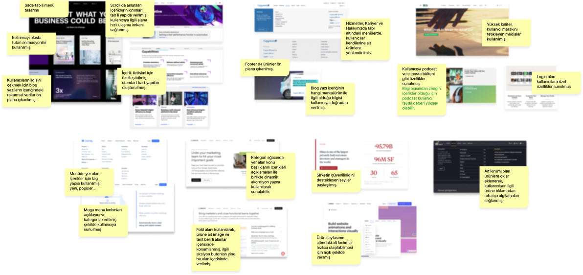
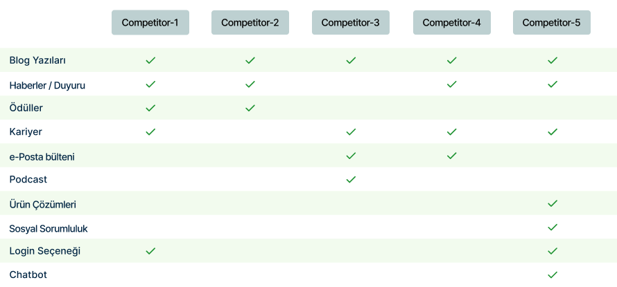
We analyzed the website designs of companies operating in similar sectors or offering a high volume of services and products. This analysis covered menu structures, category trees, communication languages, and homepage contents.
Benchmark
The findings were grouped comparatively by page.Benchmark
IDEATE

Card Sorting

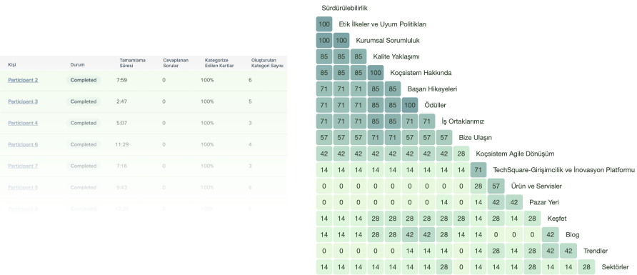
We identified the main pain points of the category structure.

Using Optimal Workshop, we conducted card sorting at the level of main categories and subgroups. We examined the relationships between the categories formed by participant groupings (similarity matrix).Ideate Card Sorting
KoçSistem Web Development Workshop

Information Architecture

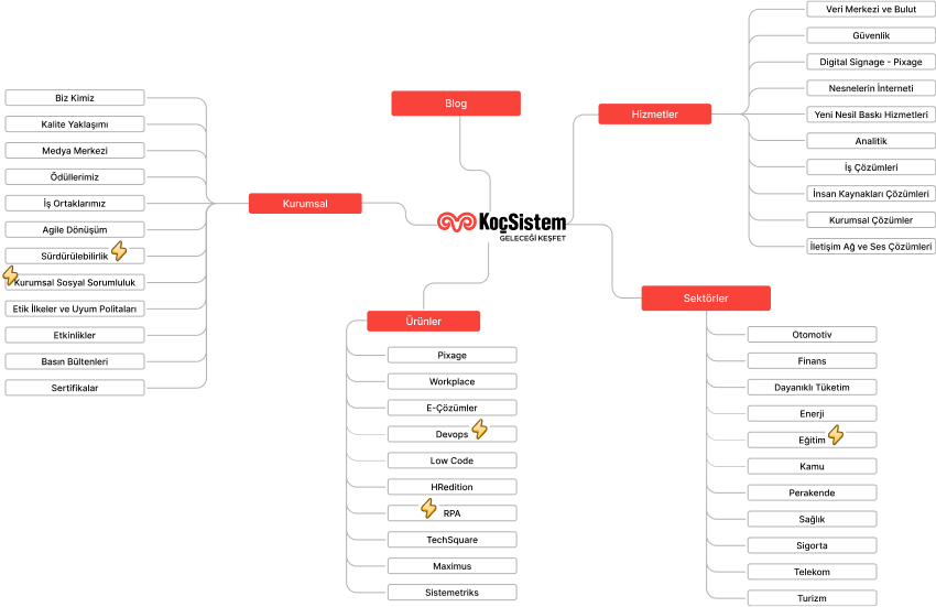
With the pain points we identified and the results of the card sorting study, we developed an information architecture tailored to the website's goals. Our primary goal was to enhance the discoverability of areas that were previously overlooked.
Information Architecture

“In our UX research for KoçSistem, the main focus was on ‘information architecture.’ By conducting a card sorting study, we provided a general perspective on user expectations and usage habits. We combined the outputs of UX research with our client's industry experience to create a simple and understandable structure.”

semih_elarslan_avatar
Semih Elarslan
UX Lead at Brew

“We noticed that users were getting lost on the site due to the complex menu structure. By conducting a card sorting test with our client, we rebuilt the information architecture, resulting in a smoother and more intuitive site navigation.”
selin_sevim_celik_avatar
Selin Çelik Sevim
UX Designer at Brew
DESIGN

Solutions & Key Features

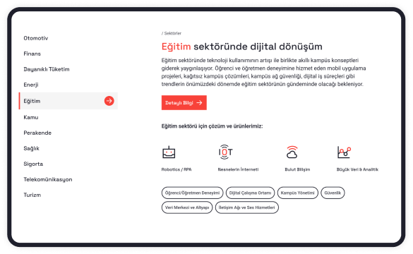
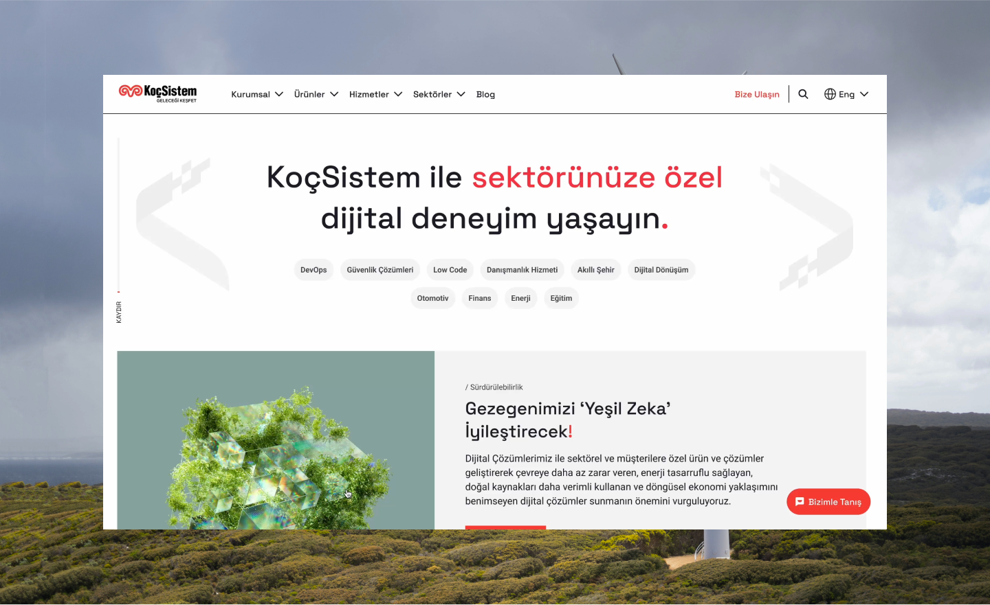
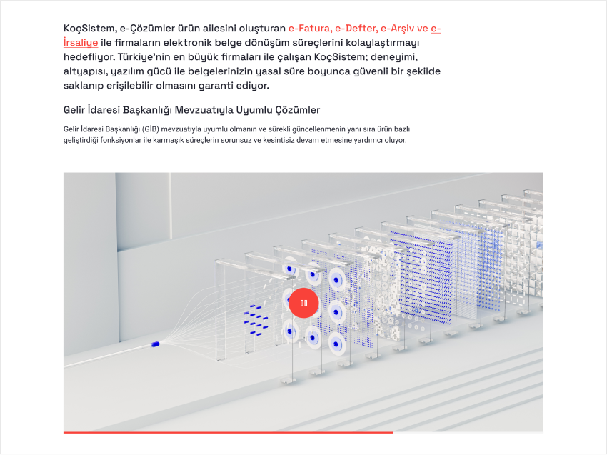
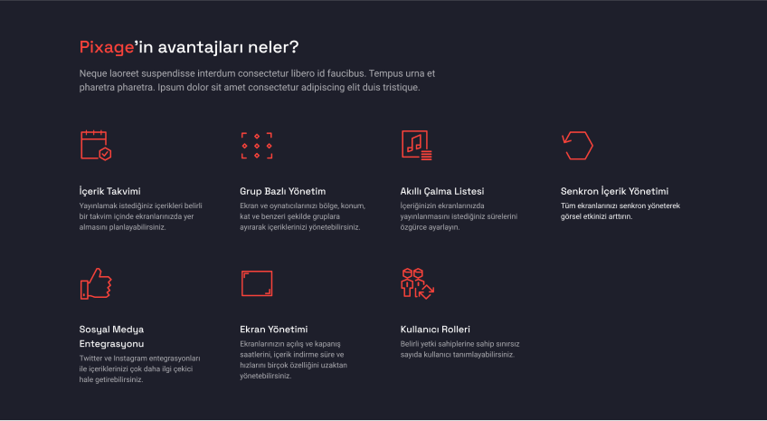
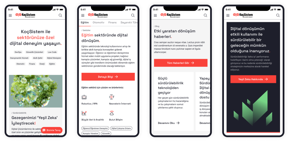
We designed a mobile-first, user experience-focused, dynamic, and aesthetic interface that aligns with the brand identity, using a unique visual language that integrates stock images with the institution's context.

KoçSistem Web Development SolutionsKoçSistem Web Development Solutions
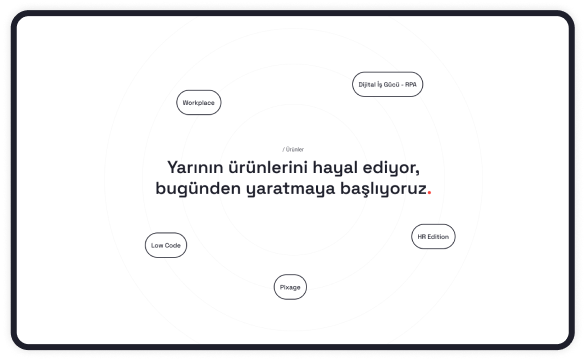
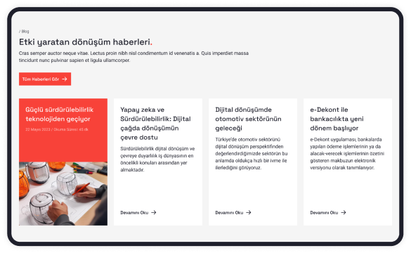
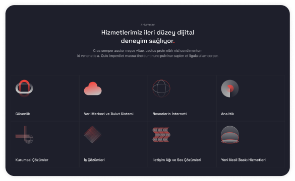
For Services, Products, Sectors, and Blog sections, we moved away from image usage and created dynamic card structures on the homepage with vector drawings.

KoçSistem Web Development
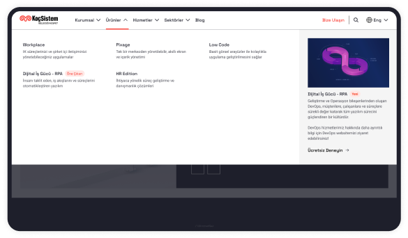
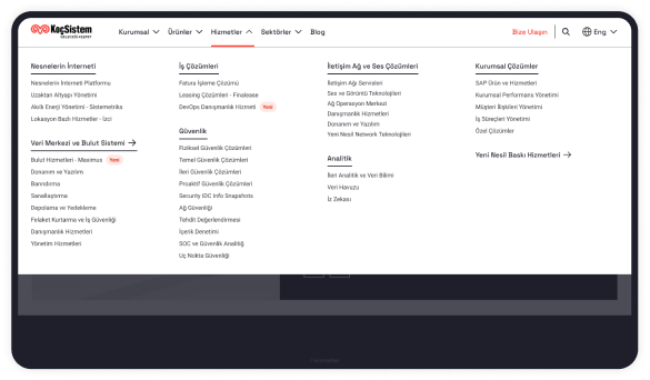
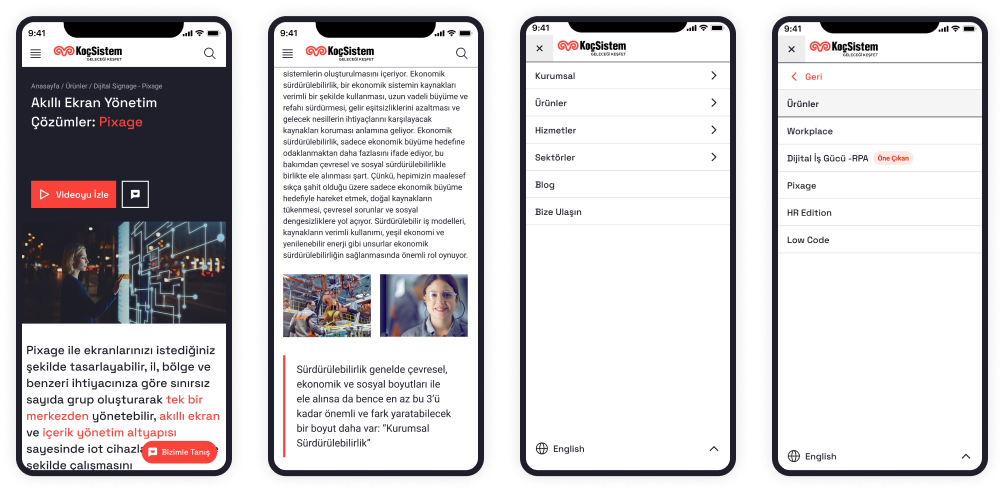
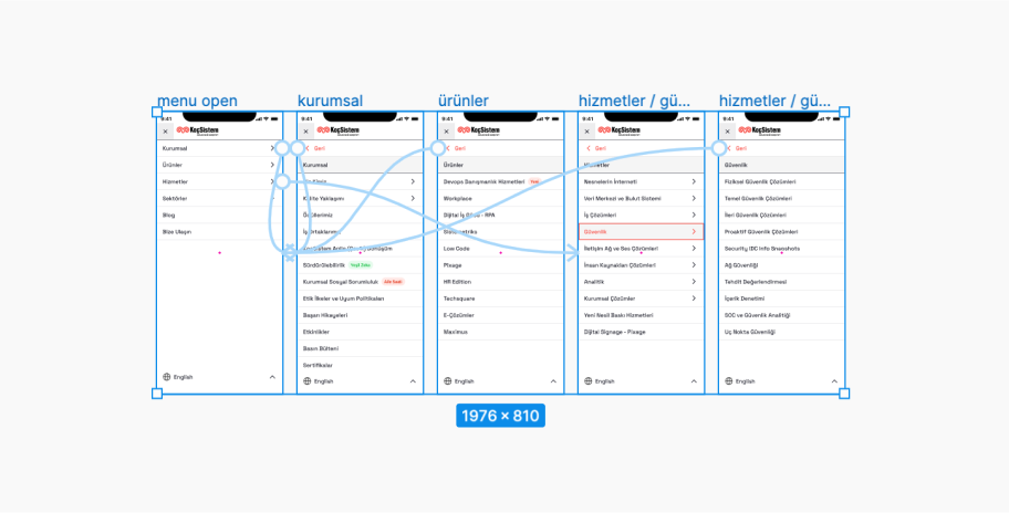
We simplified the Products, Services, and Industries and organized them into a mega menu. The structure we developed allows for highlighting any product or service within the mega menu.

KoçSistem Web Development Mega Menu
KoçSistem Web Development Menu
KoçSistem Web Development Screen
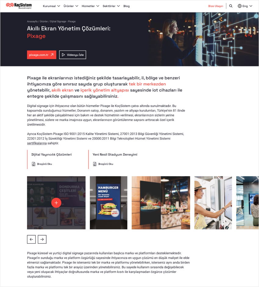
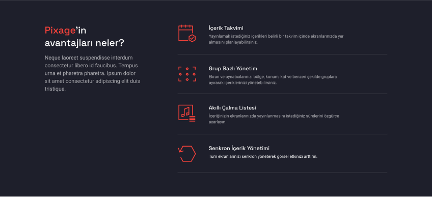
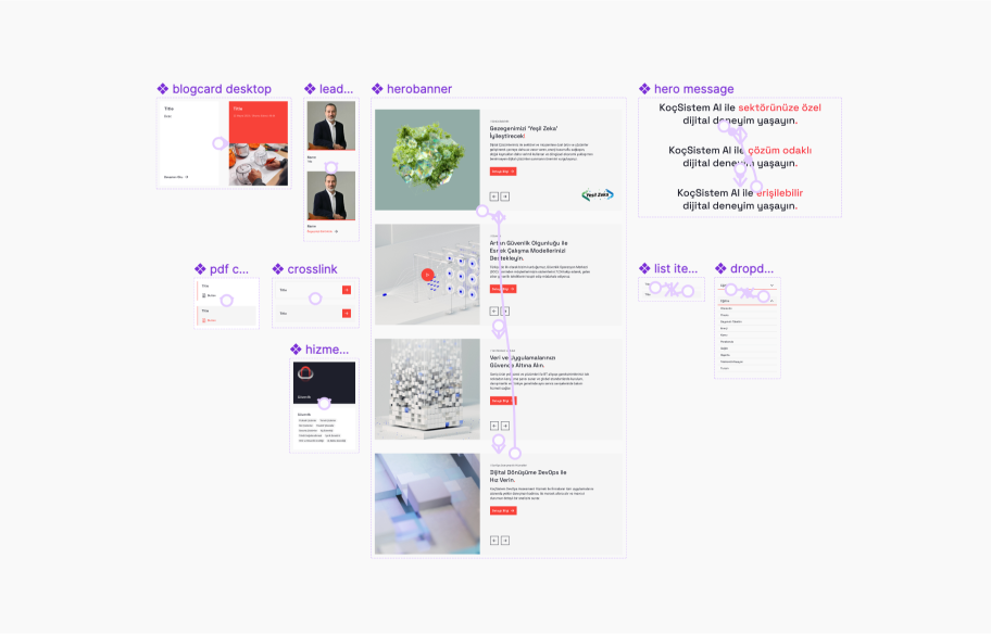
When designing our modules, we ensured they were reusable and flexible. This increased efficiency during development and content management.
KoçSistem Web Development Video ScreenKoçSistem Web Development Video Screen

Incorporated video views on the page
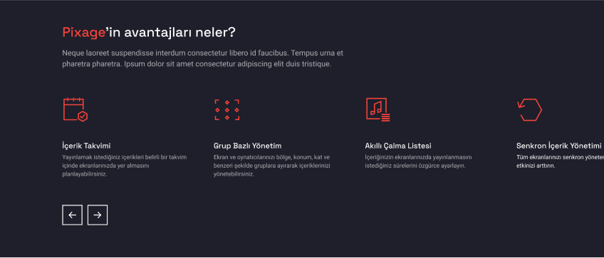
KoçSistem Web Development Content And VectorKoçSistem Web Development Content And VectorKoçSistem Web Development Content And Vector

Views where content and vector drawing will be used

KoçSistem Web Development Cross-links

We connected content through cross-links

UX UI Design HeaderUX UI Design HeaderUX UI Design HeaderUX UI Design Header

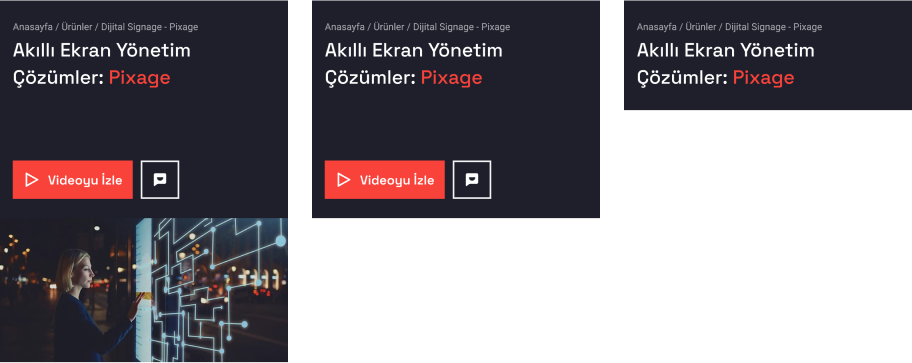
Another example of a component designed to be flexible, responsive, and reusable.
DESIGN

Design System

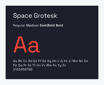
We created a style and component library that encompasses the fundamental elements of the project. This makes the design process more systematic, enabling reusability and fast development, which enhances production efficiency.

KoçSistem Web Development Typo
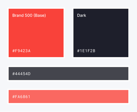
KoçSistem Web Development Colors
KoçSistem Web Development Content IconKoçSistem Web Development Content Icon

Core Style Elements

KoçSistem Web Development Video ScreenKoçSistem Web Development Video Screen

Some key components from the design system file
PROTOTYPING

Interactive Prototypes for a Realistic Product Experience

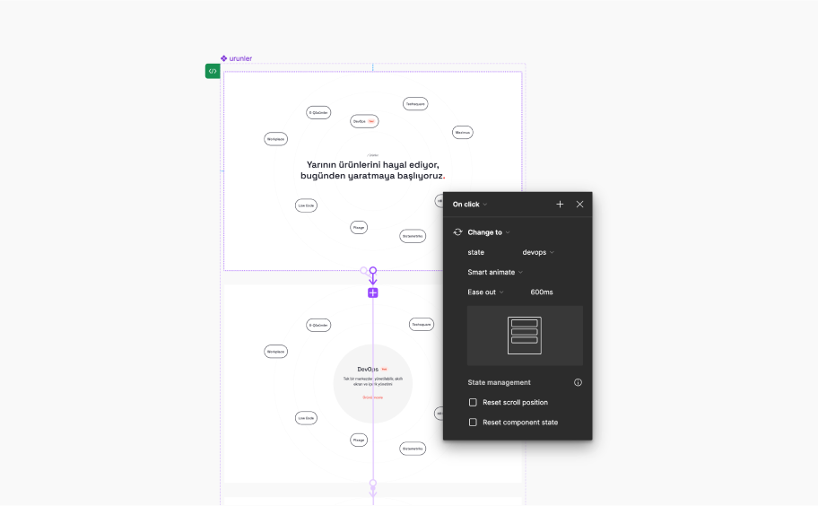
We presented the designs by prototyping them using the Figma tool. This allowed us to demonstrate user flows, interaction designs, and animations to our clients in the most realistic way possible. This approach enabled our clients to visualize the final product accurately. Our prototypes helped prevent misunderstandings among team members during the development phase and eliminated uncertainties.
KoçSistem Web Development PrototypingKoçSistem Web Development PrototypingKoçSistem Web Development Prototyping

Realistic Experience with Prototypes

DEVELOPMENT

Our development approach and the reasons for our technology choices

React
RemixJs
Module CSS
CSS Variables
SEO Optimization

SSR
GraphQL
Storybook
Google ReCapthca
Crux DB
DeCap CMS
React
MeiliSearch
Modular and Manageable Structure
During the project development, we opted for React and Next 13 to create a modern and effective structure. By leveraging Next 13's app routing feature, we made our project modular and manageable.

To build a dynamic structure, we created a pool of components using React for the user interface and the CMS. When content managers wanted to create a page through the CMS, they could select desired components from this pool, input their data, and arrange the elements in the interface as they wished.

This approach allowed for the rapid and dynamic creation of new pages with just data entry, eliminating the need for new development.
"With our dynamic content management system, we enabled the quick, dynamic, and design-compliant creation of hundreds of pages."
demir danis avatar
Demir Danış
Software Development Lead at Brew
For each component created in the React interface, we made corresponding entries in the CMS. This dynamic structure allowed the components selected and populated with data in the CMS to be matched with the React components on the interface, enabling the creation of hundreds of unique pages with just data entry from the CMS. Additionally, we incorporated a theme feature, allowing different website designs to be created for KoçSistem's various websites using the same infrastructure.
Importance of Synchronization
We used "Directus CMS" as our database and facilitated data transfers via GraphQL. During implementation, we utilized the "@graphql-codegen/cli" package to generate TypeScript models from the database data automatically. This ensured that the models in the database remained synchronized with the client-side models, preventing runtime errors caused by synchronization loss.
Search Engine Optimization
We adopted an SEO-focused approach. By using RemixJS's SSR feature, we rendered pages with their data server-side, making them indexable by search engines.
Design System Compatibility and Storybook Usage
In designing, we employed CSS variables to implement the design system directly and integrated it using Module CSS. This resulted in a flexible, easily manageable, and theme-compatible development process. By using Storybook, we documented the components we created and provided a reference for the development and testing teams during the development phase.

We ensured that pages maintained their responsive properties across different devices by managing the size and distribution of components for six predefined dimensions:
Cross-Device Compatibility

Mobile Min-Max(360px - 480px),

Tablet Min-Max(768px - 1024px),

Desktop Min-Max(1024px - 1440px),

Desktop_Large(>1728)
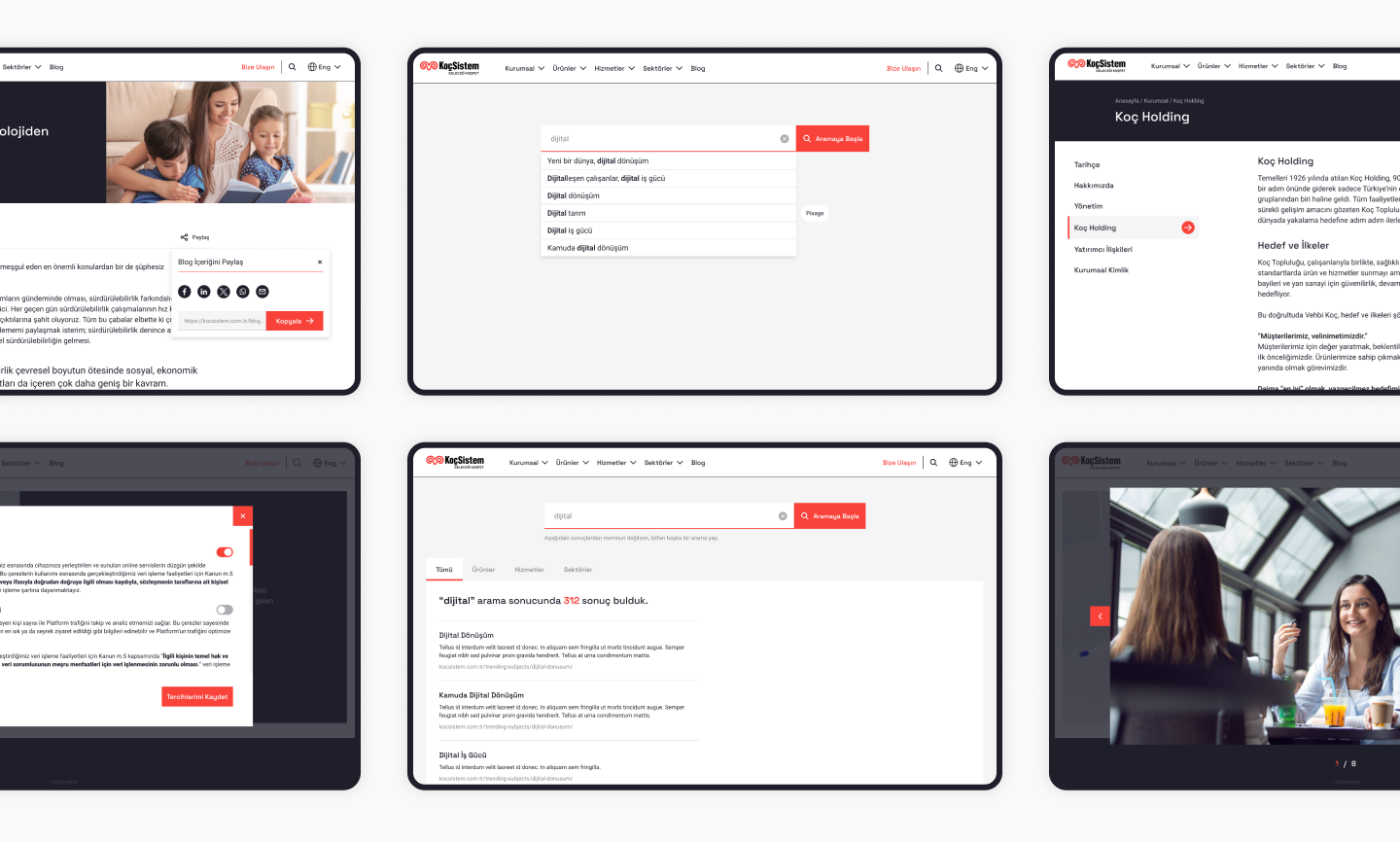


This approach allowed us to maintain consistency and usability across various screen sizes.
KoçSistem Web Development Design
Volkan Aytan
Sr Digital Marketing & Marketing Comms Manager, KoçSistem
"They delivered the project and met our needs on time."
With the new site, the client saw an increase in organic traffic and page loading speed; they also received positive feedback on the site's design. Brew Interactive gelled seamlessly with the internal team, allowing for a smooth and swift collaboration. The team also completed the project on time.
RESULTS

The Power of User-Centric Design

By leveraging innovative design principles and the latest technologies, we reshaped the KoçSistem website, transforming and enhancing the user experience. This transformation was achieved through a simplified interface that made navigation easier for users. As a result, there was a significant improvement in the website's user experience.

"Experiencing and comparing the renewed KoçSistem website with its previous versions was incredibly satisfying and impressive, allowing us to observe and experience the transformation in user experience firsthand."

irem alara kutluay avatar
İrem Alara Kutluay
Project Manager at Brew

"By supporting the use of stock images with illustrations and simplifying the design, we created a unique interface that allowed users to navigate the site more easily."

gulay tekneci avatar
Gülay Tekneci
Sr. UI Designer at Brew
Download a presentation of our recent worksSay Hello

CONTACT US